
PS. I know tablet and mobile view are....
dead broken. Blame me for I have no extra time to finesse these as of now :')
Project Overview
True Swing is all about helping golfers find a better, more natural swing. The old website, however, wasn’t quite telling that story.
I took on a full redesign of the core website experience, giving the pages a complete visual and UX overhaul. The goal was to make True Swing feel more modern, premium, and engaging, while making sure the site actually did its job: turning curious visitors into potential customers.
This wasn’t just a visual facelift. I rethought how the pages were structured, how the story was told, and how users were guided toward taking action.
Objectives
The existing experience had plenty of information, but there was an opportunity to make it work harder.
The redesign focused on three things:
Look better. Read easier. Convert better.
I wanted visitors to immediately understand what True Swing was, why it was different, and what they could do next, without having to work their way through a wall of content.

Process and Approach
I started by breaking down the existing core pages and looking at the entire user journey, from that first impression all the way to the final CTA.
Instead of designing each section independently, I treated the page like a story.
Hook them → Tell them why it matters → Build trust → Give them a reason to act.
That meant reworking everything from the hero sections and content hierarchy to the way offerings, testimonials, and CTAs were presented.
Wireframes & Prototyping
explored different layouts and page structures in Figma, testing how content could be arranged to create a smoother path through the experience.
A big focus was reducing friction. Users shouldn’t have to hunt for the important stuff or figure out what to do next.
I designed the pages around natural decision points, introducing the offering, building interest, adding credibility, and then giving users a clear next step.


Visual Design
The redesign gave True Swing a much more contemporary look and feel.
I pushed the visual language toward something clean, premium, and energetic, using bold typography, strong imagery, generous spacing, and sharper composition.
The idea was to capture the feeling of golf without falling into the usual overly-polished, corporate sports aesthetic.
The result feels more like a modern lifestyle brand while still staying grounded in what True Swing is actually about: helping people play better and feel better about their swing.
The Result
A complete rethink of True Swing’s core website experience.
The redesign moves the site away from simply telling people what True Swing does and toward showing them why they should care.
The new experience combines a stronger visual identity with a more intentional UX, creating pages that feel better, communicate faster, and are built around conversion from the start.
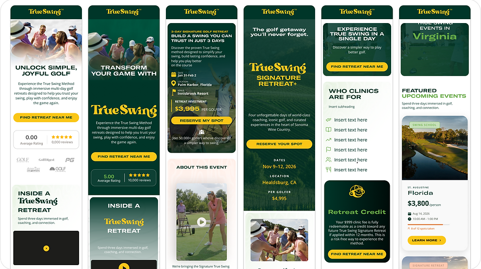


TrueSwing
For TrueSwing, I redesigned key pages across their website and developed landing pages tailored for different campaigns and audiences. The focus was on creating clearer user journeys, stronger calls to action.