
PS. I know tablet and mobile view are....
dead broken. Blame me for I have no extra time to finesse these as of now :')
Blockchain Explorer
I reimagined an existing product with a focus on making complex blockchain data easier to navigate and understand. I redesigned key experiences and workflows to improve efficiency, reduce friction, and create a more intuitive interface. The result is a cleaner, more streamlined explorer that makes finding and interpreting on-chain information feel significantly more effortless.
Project Overview
Blockchain Explorer is a core product experience that helps users explore blockchain activity, track transactions, and make sense of on-chain data. My role focused on rethinking the visual and UX direction of the Explorer, making complex information easier to scan, understand, and navigate while bringing the experience in line with the broader brand.
The goal was simple: make blockchain data feel less intimidating and a lot easier to use.
Objectives
-
Simplify complex blockchain information and make it easier to scan.
-
Improve information hierarchy across transactions, addresses, and network data.
-
Create a cleaner, more modern interface aligned with the updated brand.
-
Make key actions and information easier to find.
-
Build a more consistent experience across the Explorer ecosystem.
*PS More images to be uploaded as they go live.

Process and Approach
I started by looking at the existing Explorer experience and identifying where the interface was doing too much, or where important information was getting lost in the noise.
Some of the key areas I focused on were:
-
Information overload: Blockchain data can get dense quickly, so I looked at ways to structure information without removing the depth users need.
-
Visual hierarchy: Important details like transaction status, amounts, addresses, and timestamps needed to stand out immediately.
-
Navigation: I worked on making it easier for users to move between transactions, addresses, blocks, and other parts of the network.
-
Brand consistency: The Explorer needed to feel like part of the wider product ecosystem while still working as a highly functional data tool.

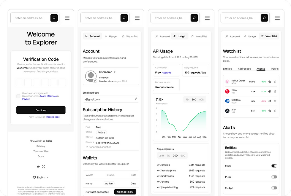
Wireframes & Prototyping
From there, I explored different layouts and interaction patterns in Figma, focusing heavily on hierarchy, spacing, and how information could be grouped together.
Rather than simply making the interface look cleaner, I wanted the redesign to make the data feel easier to understand.
I worked through different approaches for:
-
Transaction Details: Restructuring dense transaction information into clearer sections, making the most relevant data immediately visible.
-
Address & Asset Views: Improving the way balances, activity, and related information are organized so users can quickly understand what they’re looking at.
-
Navigation: Refining the overall structure to make moving through blockchain data feel more intuitive.
-
Responsive Experiences: Considering how dense blockchain interfaces could scale across different screen sizes without sacrificing important information.

Visual Design
The visual direction brought the Explorer closer to the refreshed brand while keeping usability at the center.
I introduced a cleaner visual system with stronger typography, spacing, and hierarchy to create more breathing room around complex data. Instead of relying on decoration, the design uses visual emphasis to guide users toward the information that actually matters.
The result is a more polished Explorer that feels modern without losing the utility and depth expected from a blockchain data platform.
Key Design Features
Clearer Information Hierarchy
Reworked dense blockchain data into more digestible sections, making important details easier to spot at a glance.
Simplified Transaction Experience
Refined transaction layouts so users can quickly understand what happened, when it happened, and the key assets or addresses involved.
Consistent Design System
Applied a more cohesive visual language across the Explorer, helping different screens and data types feel like part of the same product.
Improved Navigation
Created clearer pathways between transactions, addresses, blocks, and other blockchain data, reducing the friction of exploring the network.
Rebranded Visual Direction
Updated the interface with a fresh visual system that connects the Explorer with the wider brand while maintaining its product-first functionality.
Conclusion
The redesign of the Max Travel App successfully revitalized the user experience, making it more intuitive, modern, and responsive to travelers’ needs. By addressing the issues of the previous design while incorporating new features, the app now provides a seamless and enjoyable experience, inspiring confidence in its users as they plan and manage their trips.