
Project Overview
As the in-house designer for Nutrition Kitchen, I crafted a series of email marketing campaigns designed to convert cold leads and re-engage lapsed customers. The goal was clear: drive subscriptions and help users commit to their meal plans, all while keeping the tone uplifting, clear, and motivating.
Objectives
I prioritized a clean, modular layout to help readers quickly scan the message especially on mobile.
-
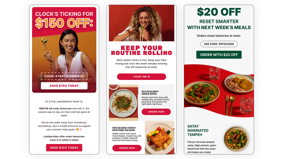
Headline-first approach: Each email opens with bold, benefit-driven headlines like “20% OFF” or “CLOCK’S TICKING FOR $150 OFF,” immediately conveying the value proposition.
-
Bright CTA buttons: I used bold, high-contrast buttons like “START MY PLAN” or “SAVE $150 TODAY” to encourage immediate clicks and make the next step obvious.
-
Limited palette per email: I kept the color schemes cohesive (e.g., black + yellow, cream + green, or red + white) for easy readability and brand consistency.

Process and Approach
I worked closely with the copywriter and marketing team to map each email to specific customer behaviors:
-
Re-engagement
-
First-time conversion
-
Cut-off reminders
-
Reset campaigns (post-weekend or holidays)
-
This helped me align the visual flow with the emotional journey of the customer, whether it was building urgency, simplifying decisions, or offering flexibility.
A/B Testing Visuals
Across campaigns, I experimented with different image orientations, photography crops, and CTA placements to measure what converted best. Learnings from earlier emails informed tweaks in subsequent ones, like using dynamic meal previews in reset emails or lead-in timers to boost urgency.


Brand Alignment
At the time of designing these emails, Nutrition Kitchen was still in the early stages of solidifying its brand identity. This gave me room to experiment with visual styles, color palettes, and layout structures that could best resonate with our target audience, busy professionals looking for convenience without sacrificing health or flavor.
Rather than follow a rigid brand guide, I approached each campaign as an opportunity to test what worked:
-
Different color systems were applied depending on campaign tone — from bold black/yellow urgency pushes to calm green resets.
-
Photography direction was kept clean and appetizing, putting the spotlight on the food, which is our strongest selling point.
-
Typography and iconography were chosen to be readable, friendly, and flexible — adapting slightly between campaigns to see what clicked best.
This experimental mindset allowed us to gather insights from real engagement data and gradually steer the brand toward a more defined, effective identity over time, rooted in both user behavior and visual performance.
Nutrition Kitchen Email Designs
A curated set of high-converting email designs crafted for Nutrition Kitchen. This includes weekly newsletter layouts and structured campaign emails, built to engage, inform, and drive customer action. Each piece reflects a balance of clean visuals, strong hierarchy, and purpose-driven content tailored for performance.